Follow me on Insta @michelealfanodesign

Tuesday, June 12, 2012

onefinestay NYC

Image from Soho Apartment (via onefinestay).

For a few days and nights,
would you want to experience someone elses NYC lifestyle
while they're out of town?

How do you go about this?

Who do you contact?
You contact onefinestay, who will be able to book your stay with 24/7 service. Its an innovative alternative to staying over in a hotel without compromising on service and comfort. Read more about onefinestay.

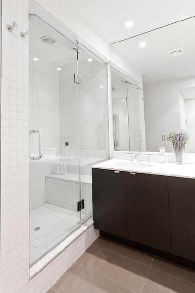
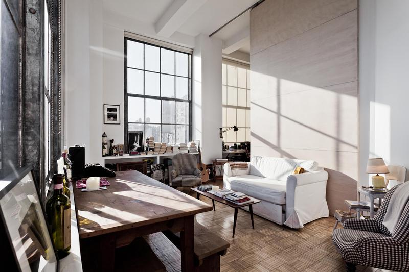
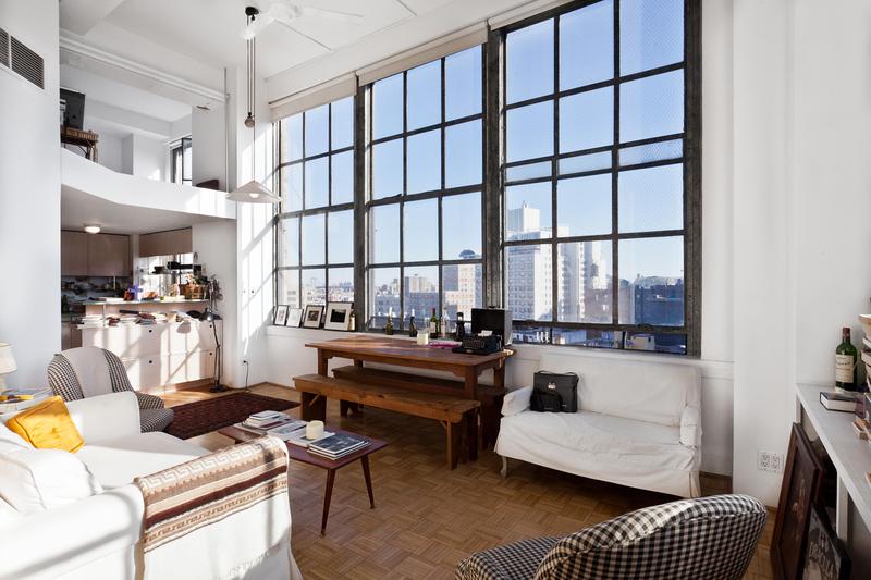
If your wondering what some of onefinestay's NYC homes look like,
here's a peek:

(all images via  onefinestay)


Soho modern chic two bedroom:


None

None
None

None

NoneNoneNone


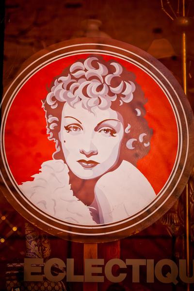
Union Square Eclectic one bedroom :


None


None


None


NoneNone


What an amazing opportunity to step into someone elses life
and service is included!!

Book a stay! If I didn't live in NYC, I would!


You can find onefinestay on their WEBSITE, FACEBOOK, TWITTER, EMAIL!!


Saturday, June 9, 2012

Designer Spotlight: FLUX


FLUX CHAIR
 (IMAGE VIA FLUX FURNITURE WEBSITE)

Dutch designer-duo, Douwe Jacobs and Tom Schouten founded FLUX, a company that creates flexible design. Their design philosophy is to make people wonder.... I know I was amazed, at the 2012 Architectural Digest show, when I watched a simple and super flat looking envelope transform into sculptural and functional art in two seconds.  It's called the Flux chair, fitting as it means "change and flow." The two designers dreamt up the flux chair straight out of TU Delft, Holland design school. It was actually their graduation project.

(image via Flux Furniture)

Douwe Jacobs, one of the innovators, describes their inspiring story on how the chair came to be. "We found inspiration in something that was paper-thin yet bulging with creativity...the works of paper artists, like Richard Sweeney, who created something intricate yet strong from a single, flat piece of material. Sweeney thought sculptures; we thought chairs. The concept for a one-piece foldable designer chair was born, and the first prototypes were cut from individual sheets of paper."

INSPIRED BY RICHARD SWEENEY
 (IMAGES VIA RICHARD SWEENEY WEBSITE)


FLUX CHAIR AVAILABLE IN MANY COLORS:  RED, BLUE, YELLOW, ORANGE,GRAY, BLACK,WHITE
(image via Flux Furniture)

(image via Flux Furniture)

Douwe Jacobs adds, "the functional design was strong, but (if we're honest) the visuals left a bit to be desired. A few hundred paper chairs later and we finally hit on a winning model, albeit one that was just 8 cm high. The challenge we faced next, however, was our biggest yet. From paper to polypropylene, the single sheet of durable material from which the now flux chair prototypes were cut, turned out so big that we were told that producing an individual chair for less than a fortune could never be done...but we were stubborn types who wouldn't take no for an answer. So we raised the cash to engineer a state-of-the-art injection mould, using the biggest moulding machine in the Netherlands. It's the size of two buses - told you it was big. That little obstacle taken care of, the first flux chairs were produced. To be sure they really are as great as they're cracked up to be, every chair is checked and double-checked in the factory before they're flat-packed to be sent to lucky flux customers. Now these award-winning designer chairs are busily living happily ever after in homes and offices all over the world."

Watch their innovation come to life in this video:


                                                               FLUX CHAIR VIDEO

I asked Douwe about its construction. He adds," the Flux chairs are made out of a special grade of polypropylene, optimised for folding. This type of plastic makes it possible to create integrated hinges, next to the fact that it's very durable and weatherproof."

I played with the chair myself and it is easy to transform. The versatality gives this design its cool factor. It can be used in so many different ways: use them in your garden, in a retail space, in a restuarant, in an office, or even at a wedding:


The flux chair even has a mini version that comes in six colours to match its older sibling. Even has a cushion!


Are you lovin' FLUX as much as I do?


FLUX design is innovative, whimsical and artful!

You can find FLUX on their WEBSITE, FACEBOOK, & TWITTER

Thank you Douwe and Tom for the interview!


Saturday, June 2, 2012

Designer Spotlight: Golden Gate Furniture Company

RICHARD BULAN OF THE GOLDEN GATE BRIDGE COMAPANY
How would you like a piece of history in your home? Like the Golden Gate bridge? Well, its available because in 1993, Richard Bulan had a brilliant idea after listening to a radio show. He heard the original steel that was placed on the Golden Gate bridge in 1937 was going to be removed due to exposure to harsh weather conditions.  So he wanted to get his hands on that steel and make furniture out of the material that would be ultimately thrown away. I was intrigued by Richard's innovative repurposed creations at the 2012 Architectural Digest show and was able to interview him about his inspired story and how his unique Golden Gate Bridge Furniture company evolved! Read on:

GOLDEN GATE BRIDGE, SAN FRANCISCO CA

Tell me about yourself. What is your design background?

I took some architecture and drafting in school, but I am actually a finance major. Things just sort of snowballed when I created my first Headboard, and I ended up going in a direction I hadn't really expected.  I had always envisioned myself running my own business, and when this opportunity came along, it fed both the entrepreneur and the designer in me.
 
How would you describe your design aesthetic?

I like things that are simple, with clean lines.  Besides the historical aspect of the material that I’m working with, I suppose it’s the clean, straight lines of the Bridge’s art deco design that appeals to me as well.   


No great designer exists without inspiration. Please take us behind the design of your Golden gate inspired furniture and light fixtures. How did it all come to be? Tell us the inspired story. What fueled your creative process?


I was born and raised in San Francisco. I have many childhood memories of spending weekends at the Golden Gate Bridge… playing underneath it, walking across it, picnicking next to it, and bringing visiting family out to see it. When I saw the story about the Bridge’s handrail being replaced, I just simply thought “Wow… that would make a cool headboard.” I just wanted a piece of it for myself. So I called the news station to find out the name of the contractor that did the removal, and then contacted them about purchasing a section of the steel. However, it was then that I realized that the sections were 12 ½ feet long and weighed about 1000 pounds each. I couldn’t just throw it in the back of a pick-up truck and attach it to my bedframe. So I hired a truck to bring the handrail to my home, where I then spent a month cutting and grinding down the section into a 115 pound queen headboard. However, the section of rail also yielded three more headboards just like it. When friends saw it, they expressed interest in headboards for themselves, and I realized there was a market for such a product. At this point I started looking into the feasibility of starting a company based on this idea, and later went back to the contractor to negotiate purchasing the remainder of the handrail sections.


Since acquiring the handrail and starting the company, I’ve come to create table and lamp designs that allowed me to use every piece of the rail in a way so that nothing was wasted.  It provides a variety to our product line, so that there is something that appeals to everyone.


What designs are you most proud of and why?

Of course, The Headboard is my original and signature design.  It is what started it all.  However, I’m very excited about our new Task Lamp design, since it utilizes the small pieces of steel that come off of a rail during the production of our larger designs, so nothing is wasted.  With this design, I found myself becoming even more creative by giving an abstract reference to the straight lines of the handrail sections themselves, as well as to the roadway lights that line the span of the bridge.  Additionally, I’m thrilled with the new Club Table design and how it incorporates, for the first time, locally sourced urban salvaged wood for its table top and shelf.  It brings an organic warmth to the design, and I think the two elements of the wood and the paint color (International Orange) complement each other beautifully.


What are your plans for the future and beyond?

Right now, I’m just enjoying the opportunity to completely immerse myself in the creative process of designing products and working with local artisans to help bring my prototypes to life.  I’ve always enjoyed running my own business, and I want to continue to move forward with this endeavor.  However, I know I am working with a finite amount of steel.  I acquired about 200 sections of railing, and I’ve probably used about 40 sections of it.  Over the years, I’ve lightened up the newer designs so that they incorporate new steel.  This allows more flexibility to the design process and it helps stretch out the lifetime of the handrail material that I’m working with.  However, I know that I will eventually run out, which is why all of our designs have a limited production run - all pieces are numbered and come with a Certificate of Authenticity.  So I will continue to create and build new designs as long as I can continue do so, and then when I run out of material… I guess I’ll just have to cross that bridge when I come to it.

Thank you Richard for the interview! To check out more of his innovations,click on the Golden Gate Furniture Comapny website!!


Wednesday, May 30, 2012

DISTORTED ARCHITECTURE by artist Nicholas Kennedy Sitton

Artist Nicholas Kennedy Sitton exposes how disoriented and excited he felt once he moved to San Franscisco. His whole world changed and thru photo manipulation took images of typical urban structures in San Franscisco and deformed and twisted them into surreal landscapes. He wanted to capture a "moment of demolition and a sense of falling into itself." You certainly feel its energy! Talk about architectural deconstruction!! See these innovative images below:


(all images via Flavorwire)

Amazing manipulation! Incredible!

Friday, May 25, 2012

TREND: TRANSPARENCY IN DESIGN

 
Today’s designers are taking cues from psychology and exploring an emerging sensibility: transparency. Whether it be clear, translucent or the combination, the potential of glass for voyeuristic play is very intriguing. I have always been drawn to objects, interior spaces or architecture that exposes something, draws your eye thru space or defines our relations to others. Transparency can shape the experience: to observe or be observed is a provacative notion and design like this provokes emotion. That is what makes design successful. Let’s explore transparency within fashion, architecture and interior design and showcase the extraordinary range of rich materials and surfaces.

TRANSPARENCY IN FASHION:

Marc Jacobs Spring/Summer 2012 runway show for Louis Vuitton was breathtaking! The construction of the dresses were layered with delicate transparence, using a whitework needlework technique that arose in the 19th century called broderie anglaise. The daisy wheel pattern added lumninous texture! See images below:

MARC JACOBS 2012 SPRING VUITTON RUNWAY


MARC JACOBS AND 2012 SPRING VUITTON RUNWAY
(image source: Getty)


How special are these Charlotte Olympia pouches below?


Love these interchangeable patterned pouches within a lucite pouch! You can see your pretty bag but you cannot touch it! There are several colored pouches to choose from; for example, a leaf, an ecru striped or a leopard print. All these so perfectly give you options to pair with any ensemble. To top it all off, the spider and pineapple clasp are to die for! These special clasps magnetically fasten.


TRANSPARENCY IN ARCHITECTURE:

Diller and Scofidio are one of my favorite architects of this time. They are provocative designers who celebrate the potential of architecture by exploring how technology informs and affects our lives.


Their visual and performing arts Moscone Convention Center in San Francisco introduces voyeuristic distance as a design motif. A large video screen with fixed video cameras pointing towards the building and away, travels along the surface of the exterior facade. It broadcasts live and pre-recorded video imagery of fictional office building occupants on the screen as it moves. Your really not sure if you are being watched or are you watching people inside the building. Is it fictional or real? Are you observing or are you being observed? Would love to visit and experience it myself!


In 2001, a Hungarian architect named Aron Losonczi invented a light transmitting concrete. Yes, I said a concrete block that you can see thru!! Future homes can have foundations built above ground with the ability to transmit light into your basement. Brilliant! It is manufactured by a Hungarian company named LiTracon where optical glass fibers are blended within concrete. The fibers become a component of the concrete since they act like small pieces of aggregate. These blocks are suitable for floors, pavements and load bearing walls. Learn more. See images below:


Lightness, transparency and brightness describes architect Renzo Piano's Maison Hermes building in Ginza, the shopping district in Tokyo. See image below:


The building's facade is entirely made out of an innovative fabricated glass block. Renzo Paino collaborated with Seves glassbock company to create a building that replicates a Japenese lantern. In the daytime the translucent facade gives a hint of what is beyond, but blurred by the thickness of the glass block. At night the entire building is glowing from within.


At eye level, the glass block facade is punctuated with clear glass block which displays Hermes products beyond.


What makes this glass block unique are the painted metallic edges of the block. This innovative detail accentuates the luminous reflection of the Hermes building.


(images from Source)


 TRANSPARENCY IN INTERIOR DESIGN:
The Elizabeth Arden’s Office space in Stamford, Connecticut by Highland Associates is brilliant. It successfully incorporates the essence of their brand  thru an unique architectural element that inspires. It’s the acrylic curved feature wall that has 8,400 holes punched with makeup brushes. I love the texture it creates on one side while allowing light to transmit thru from space to space. Office workers can sit in the lounge area and observe thru the wall but also be observed. See images from Interior Design below:


(all images: photo credit: Photo by Eric Laignel, Interior Design)
TRANSPARENCY IN DECOR:

Would you invite a friendly ghost in your home? Here are some beautiful examples of modern ghostly furniture:

I love how Artist John Houshmand aims to expose wood as it really is. The transparency of the glass reveals the beauty of wood and he celebrates salvaged hardwood's wormholes, cracks, splits, etc and calls attention to it in a functionally beautiful way. See image below:


I saw the coolest see-thru table lamp at the Lignet Roset booth at the 2012 Architectural Digest Home. It is an illuminated transparent plexi-glass box that houses aluminum mesh and small lights. The plexiglass box can be clear or a smoked color. Besides arranging these boxes in groups, I imagine stacking these plexi-glass boxes and creating a partition of light! The small lights hanging from the wires looks like fine pieces of sparking jewelry! See images below: